
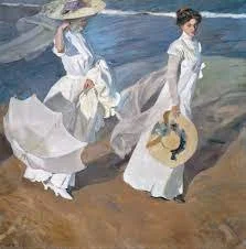
Walk on the Beach, Joaquín Sorolla
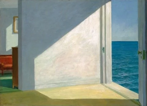
Rooms by the Sea, Edward Hopper

Disney's Yacht Club Resort

Windows
Procreate
-
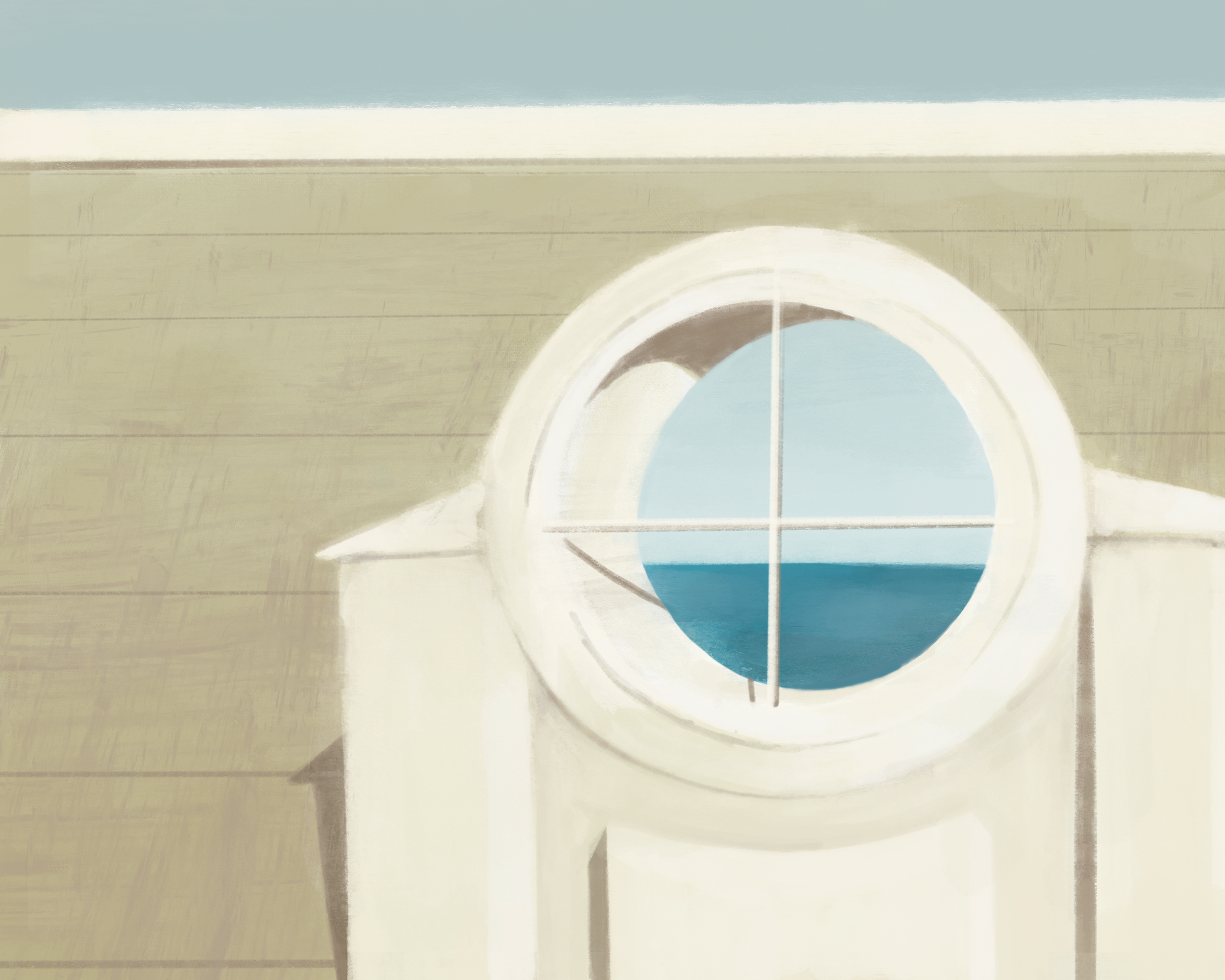
What ended up being one half of a series, this simple window study contains a lot of inspiration behind it.
I’ve gained a fascination for micro aesthetics over the past year, and it’s nice to finally put a name and access examples of my favorite niche designs through resources like the Consumer Aesthetics Research Institute.
One aesthetic I haven’t come across is something found in places like Disney’s Yacht Club Resort; a 90s take on early 1900s architecture and designs. It gives this clean, rather warm ambiance that can only be described as vacation planning videos, yachts, and rich grandparents. Even so, there’s something somewhat comforting about it.
It became my challenge to capture this essence, so I took straight from the source and began with a window directly from the Yacht Resort. I enjoyed how decorative it was yet served no purpose.
The color scheme borrows from many famous pieces that convey a similar mood, including Sorolla’s Walk on the Beach and Hopper’s Rooms By The Sea. This led to the warm tones and harsh shadows in order to mimic an afternoon sun. The calm ocean and blue sky help to counteract the warmth.
-JA
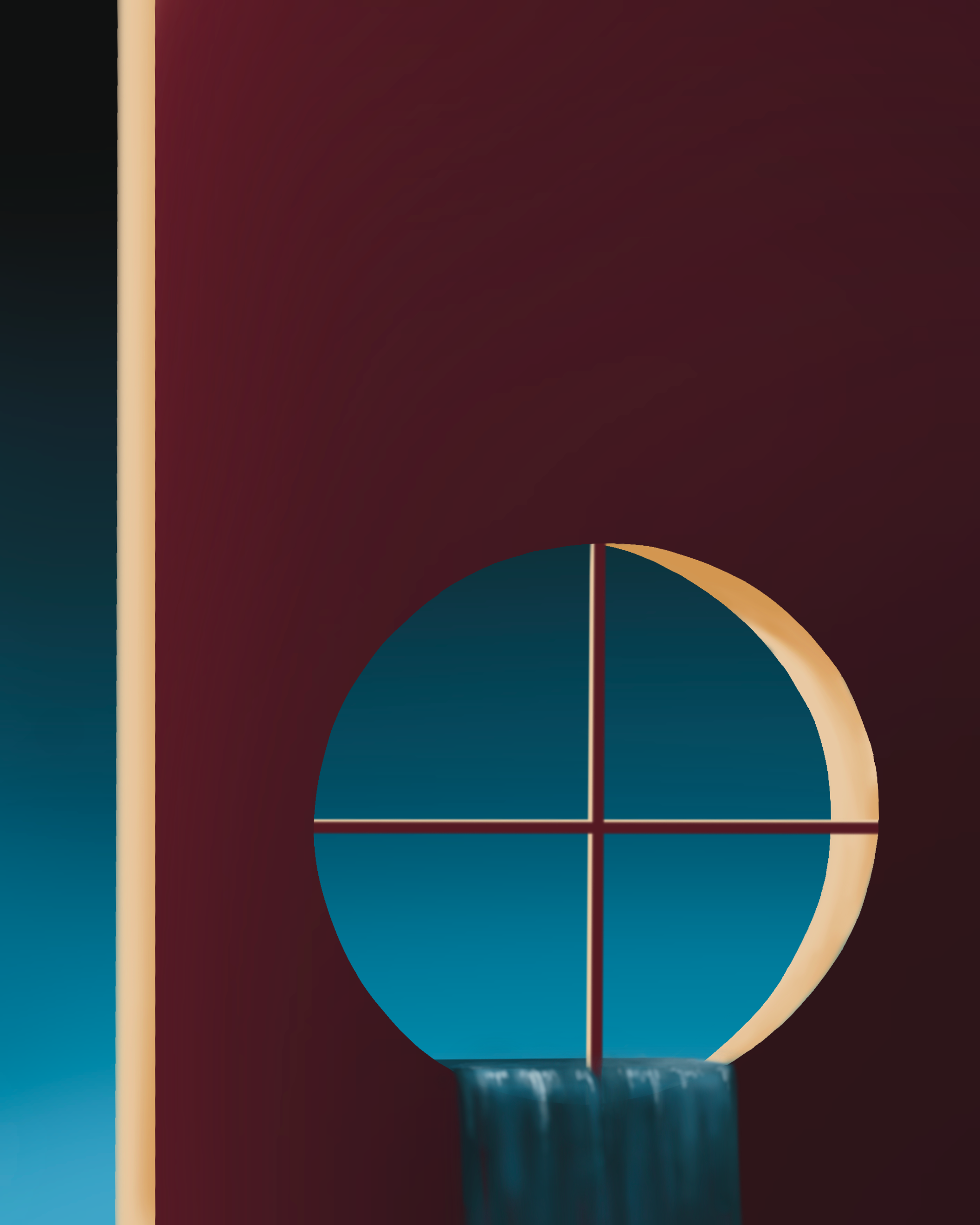

Windows II
Procreate
-
The second half of my windows study came about when my professor suggested taking the same subject but presenting it in a whole new light.
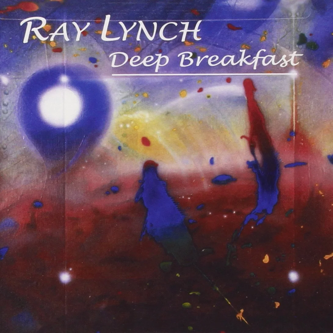
Different than the first window and its goal to capture a specific design era and mood, I took this window as a challenge to create a piece that evoked the same emotions I experience while listening to albums like Ray Lynch’s “Deep Breakfast”.
I began by reintroducing the circular window and frame, but flipping it horizontally and rotating it to a portrait. I also chose to complete the piece with an airbrush setting to portray a sense of softness.
This airbrush technique was also borrowed from one of my main references, the Yanni “Keys To Imagination” album cover art. Another element directly from this album was the waterfall, which helped to convey the calming and still emotion of the piece.
The selection of primary colors came from the “Deep Breakfast” album cover. This harmony of values seemed to fit the style and mood I was going for, especially the minimal use of yellow.
A bit more refining could be used to really bring this piece together, but it without a doubt reminds me of enjoying a long listen to Deep Breakfast.
-JA